ABOUT—
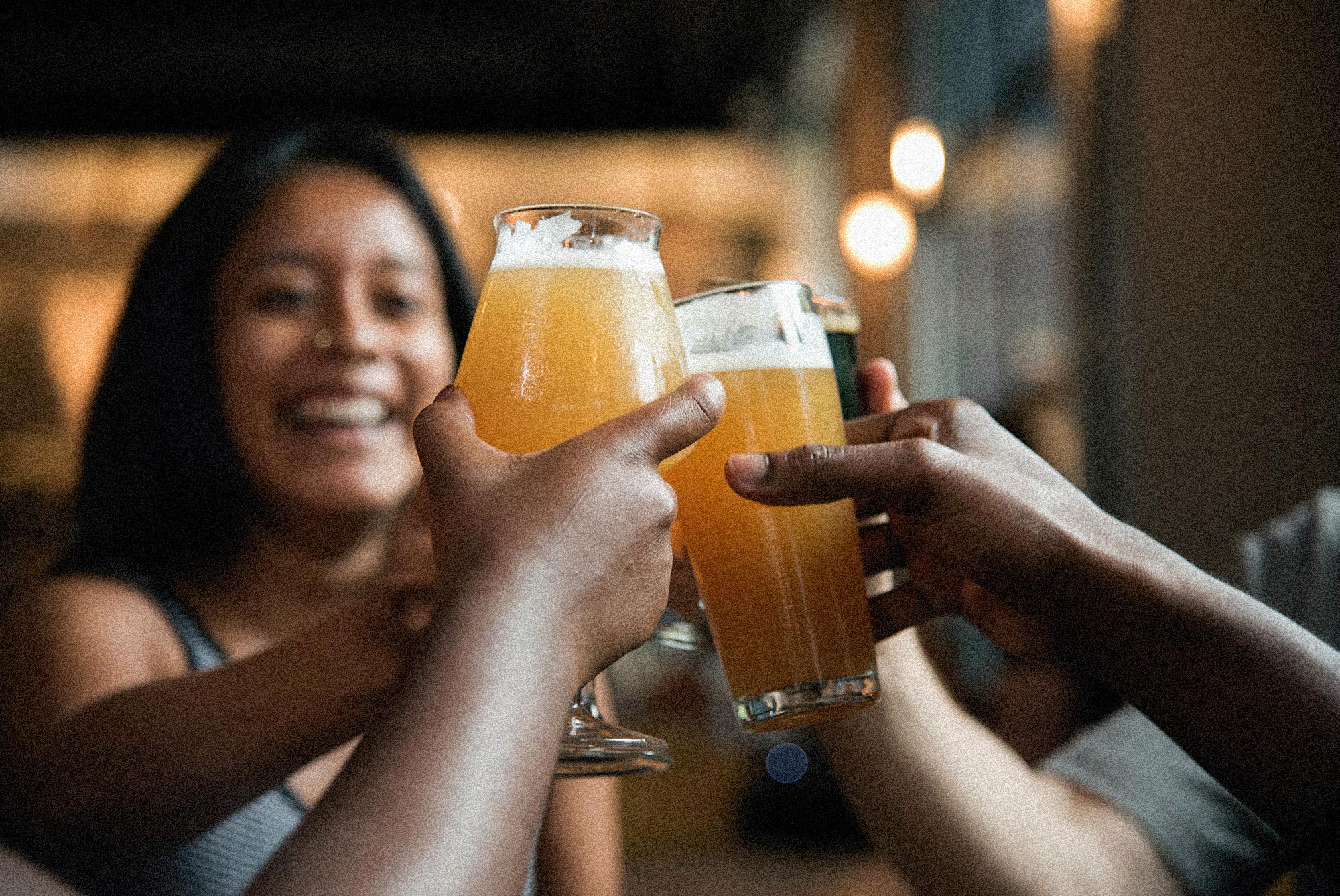
For ATLIEN (Atlanta, GA) beer nerds looking for craft beer experiences, Deuce and a Quarter is a beer pub celebrating community, culture and education.
For ATLIEN (Atlanta, GA) beer nerds looking for craft beer experiences, Deuce and a Quarter is a beer pub celebrating community, culture and education.
For ATLIEN (Atlanta, GA) beer nerds looking for craft beer experiences, Deuce and a Quarter is a beer pub celebrating community, culture and education.
For ATLIEN (Atlanta, GA) beer nerds looking for craft beer experiences, Deuce and a Quarter is a beer pub celebrating community, culture and education.
For ATLIEN (Atlanta, GA) beer nerds looking for craft beer experiences, Deuce and a Quarter is a beer pub celebrating community, culture and education.
Deuce and a Quarter is a community staple and a safe space where people go to hangout and experience craft beer made by Black and Brown creators. A place of opportunity and bridge to cultures, where diversity and inclusivity truly exists and everyone feels a sense of belonging and a true sense of community.
2022
2022
2022
///
Brand Strategy
Visual Identity
Website Design
Collateral
THE CHALLENGE—
CLIENT'S CHALLENGE—
CLIENT'S CHALLENGE—
Darren Armstrong started Deuce and a Quarter (under a different name) for fun as a way to hang out with friends and the local ATL community through the love of craft beer. As the interest grew, he realized he wanted to make a bigger impact in the ATL craft beer community and focus on Black and Brown and people of color representation in the industry, education and community involvement. He wanted to build a brand that aligned with his values and his vision for Deuce as well as to focus on growing the business.
The main challenge, was making sure Deuce stands out in a space where Black and Brown folks in the industry are underrepresented. Darren wants to provide a place where people see themselves, can be educated, where they can learn about craft beer while being exposed to Black and Brown brewers. Although Deuce and a Quarter is a place for everyone, Darren wants it to feel human and safe, especially for Black and Brown folks.
He needed help as he wasn't sure how to clearly communicate his vision for Deuce and a Quarter in way that is clear for both the craft beer folks, the community and future investors.
THE GOALS—
THE GOALS—
01.
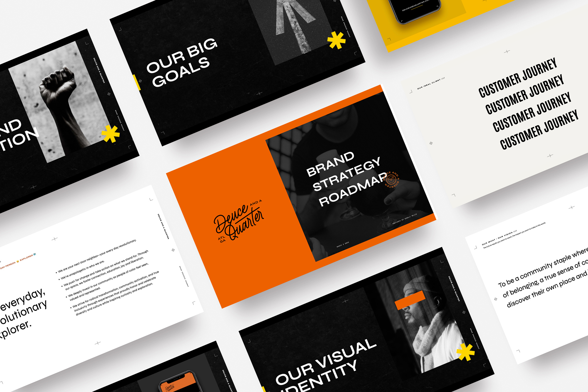
Build a brand with a clear voice and message people feel connected to
Build a brand with a clear voice and message people feel connected to
02.
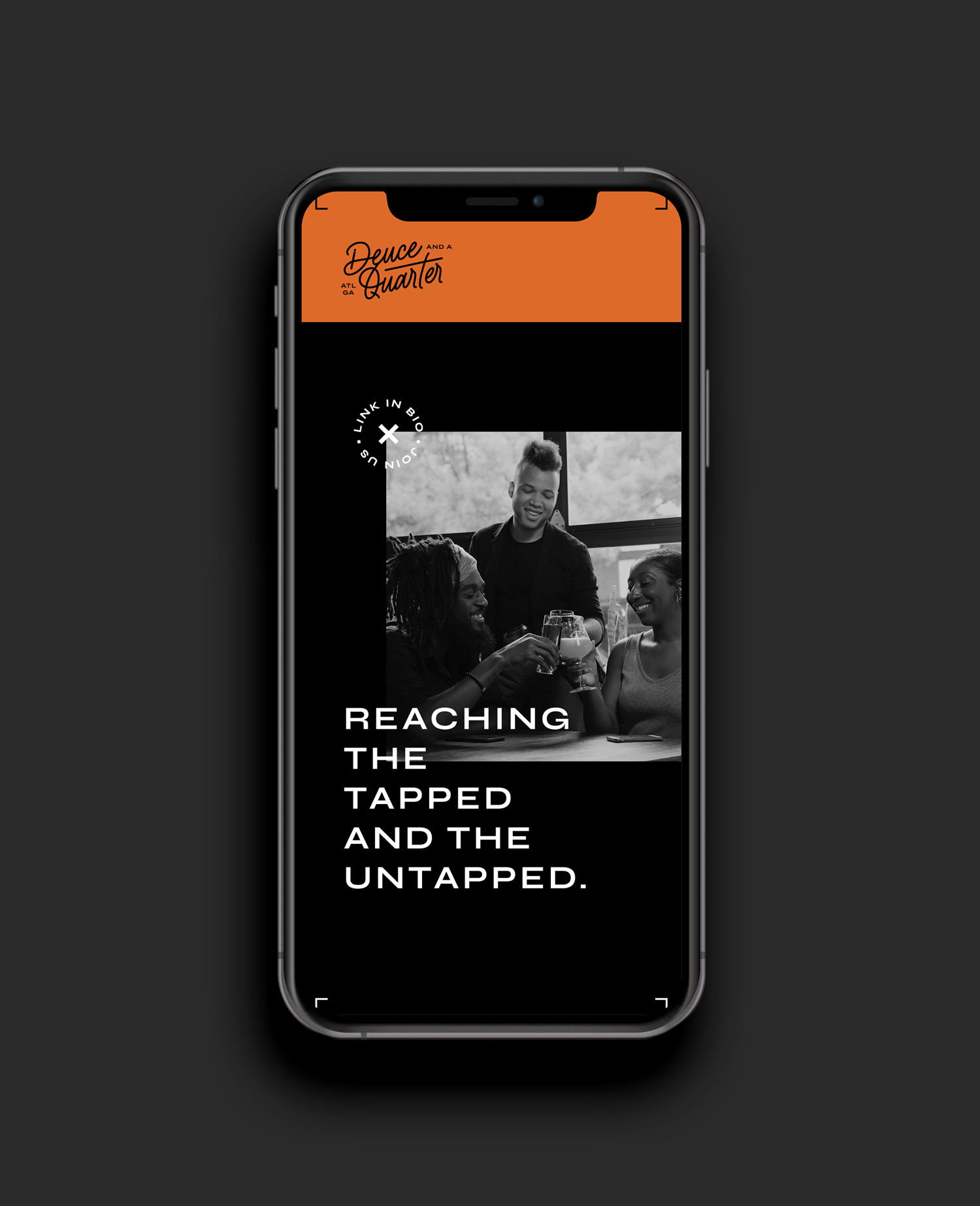
Build a brand presence via social media, website and merch
Build a brand presence via social media, website and merch
Build a brand presence via social media, website and merch
03.
Have a brand that’s ready for a brick and mortar space
Have a brand that’s ready for a brick and mortar space
—
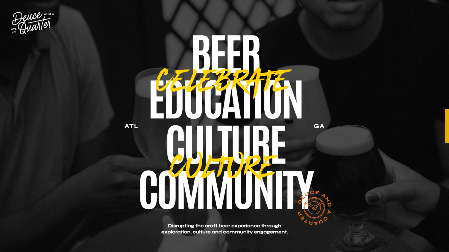
Deuce and a Quarter welcomes those looking for a sense of belonging to curated and meaningful craft beer experiences that promote connection and celebrate liberation. We deeply invest in our community so people of color feel seen, valued and represented.
Deuce and a Quarter welcomes those looking for a sense of belonging to curated and meaningful craft beer experiences that promote connection and celebrate liberation. We deeply invest in our community so people of color feel seen, valued and represented.
Deuce and a Quarter welcomes those looking for a sense of belonging to curated and meaningful craft beer experiences that promote connection and celebrate liberation. We deeply invest in our community so people of color feel seen, valued and represented.
Deuce and a Quarter welcomes those looking for a sense of belonging to curated and meaningful craft beer experiences that promote connection and celebrate liberation. We deeply invest in our community so people of color feel seen, valued and represented.
Deuce and a Quarter welcomes those looking for a sense of belonging to curated and meaningful craft beer experiences that promote connection and celebrate liberation. We deeply invest in our community so people of color feel seen, valued and represented.
DEUCE AND A QUARTER
THE STRATEGY—
Darren had a big vision for Deuce and a Quarter and wanted to accomplish many things through the space. Our biggest goal was finding clarity on what Deuce is and presenting it in a way that’s different from what other breweries are doing, while embodying the culture, mission and vision of the brand.
We wanted to make sure that visually, we brought the energy that people bring during community events. The connections, education and the experiencing of new flavors and meeting of new people. All this was important in how Deuce was visually represented which was the missing piece that was holding Darren back from showing up for his brand and building an online presence.
Once we got clear on what Deuce actually offers and how it stands out in the industry, we set "community" as the pillar and foundation for the brand. It’s in the sense of belonging and connection that the brand finds its main differentiator and firm footing. Every aspect of the messaging, visuals, and experience must highlight the community component—not just the product alone.
One thing that Geordee and I understood was there are a lot of transformational coaches out there, so it was key for Geordee to know her ultimate vision as a solid foundation for her ‘WHY’. It is this ‘WHY’ that will set Geordee apart from her competitors in her space.
KEYWORDS—
Inclusive / Unapologetic / Authentic / Familial Energy / Trailblazers / Bold / Community-Focused / Urban / Hip-Hop
Inclusive / Unapologetic / Authentic / Familial Energy / Trailblazers / Bold / Community-Focused / Urban / Hip-Hop
VISUAL CONCEPT—
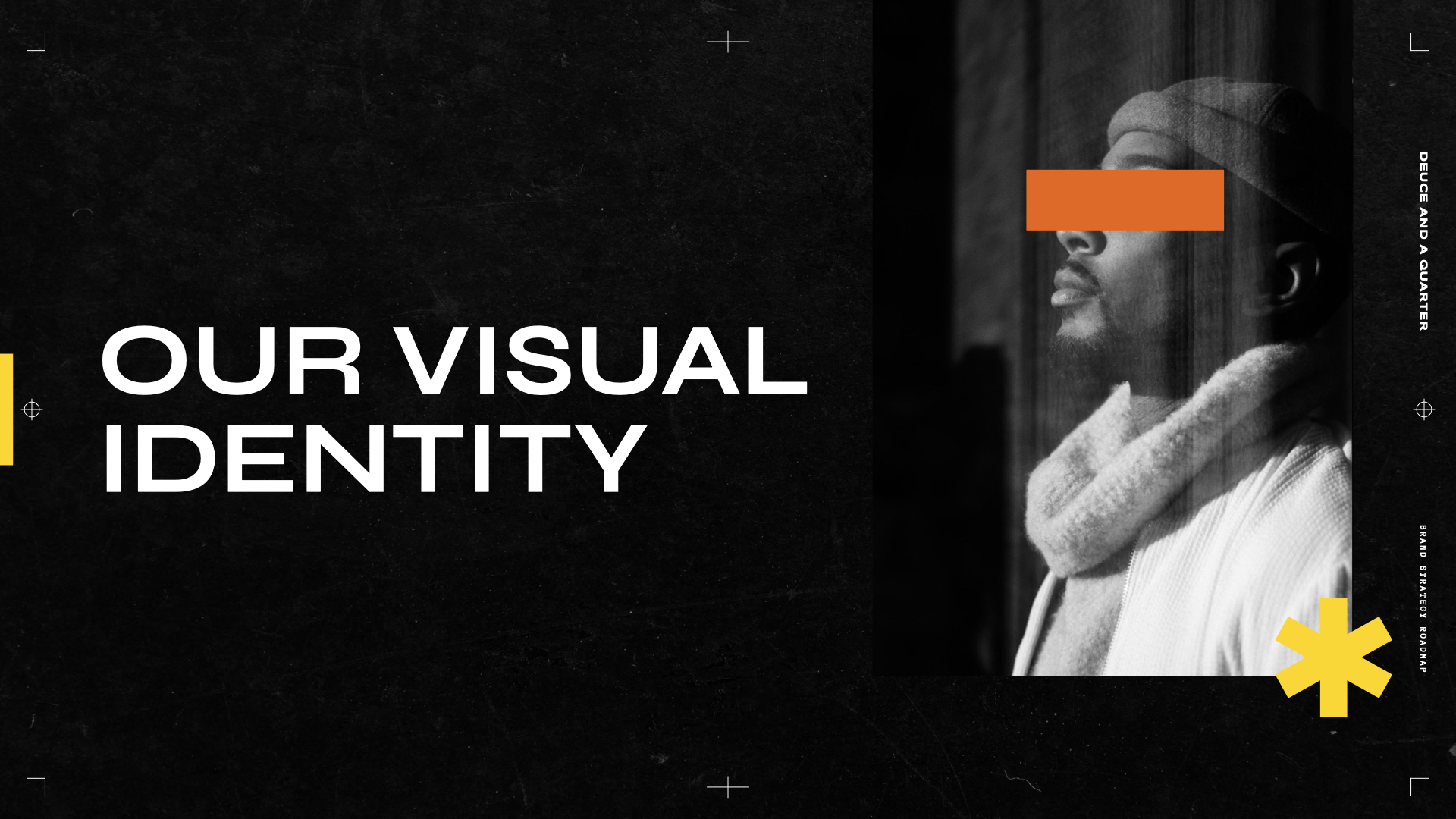
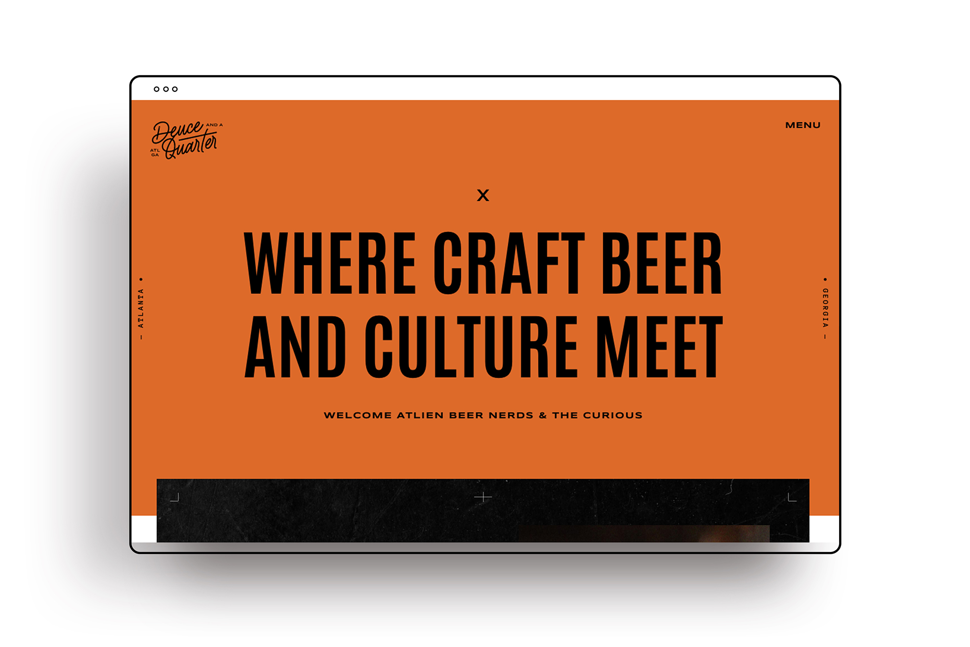
The idea behind the visual identity of the brand was to bring the urban, hip-hop culture and energy that feels authentic to the community in a way that was inclusive and welcoming to all. Something that visually, the target audience would immediately not only recorgnize but see themselves in, felt familiar, energetic, fun and exciting to be part of.
The other aspect of the visual concept was taking hints from the history of the name. In the 1950s, Deuce and a Quarter became the nickname for the Buick Electra 225 (hence Deuce and a Quarter). This was Darren's grandfather's car, whom he's paying homage to with the vision, due to his involvement in the community.
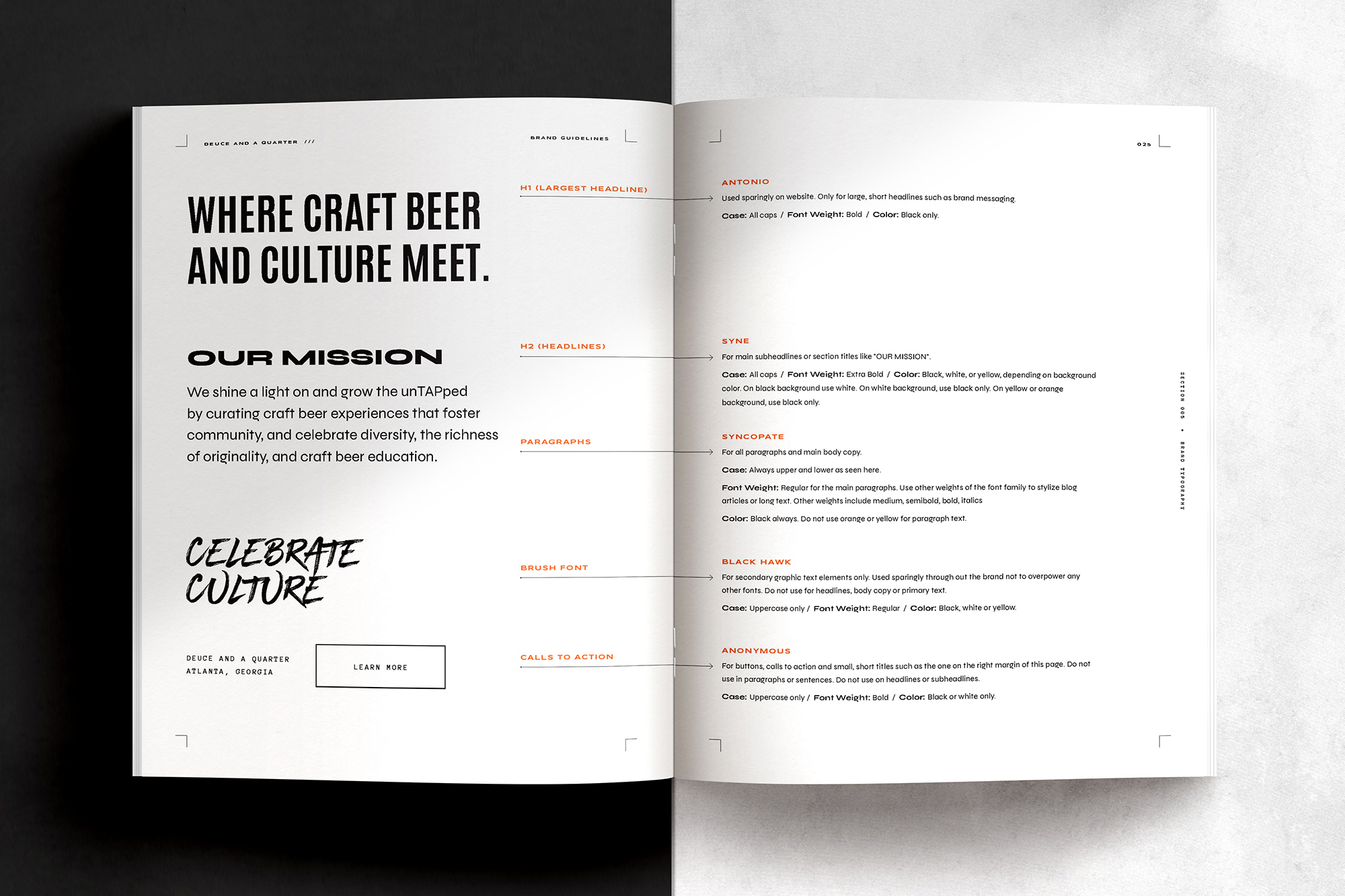
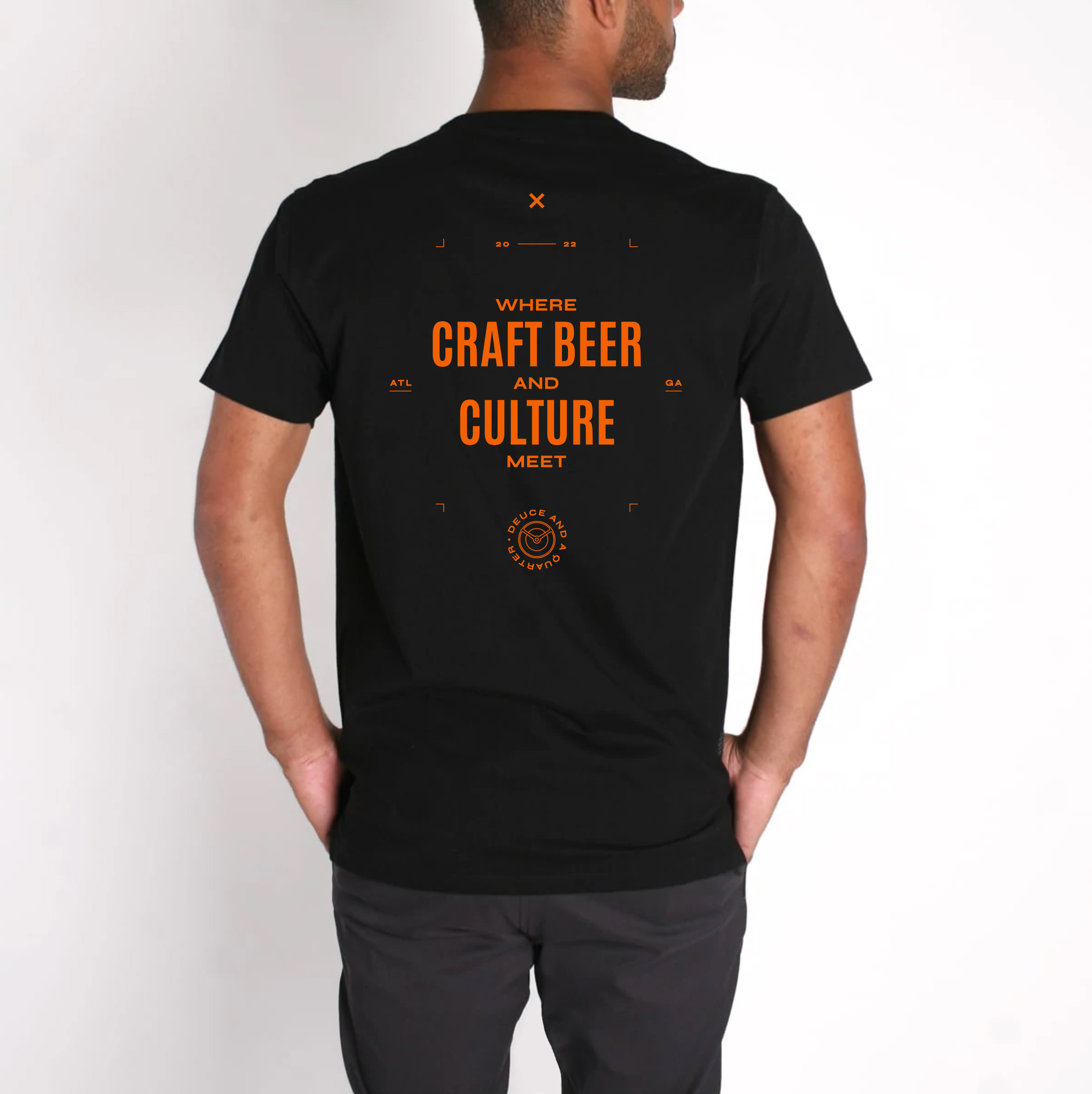
For the visual details, we used retro car typography emblems as references for the primary logo, car details for the secondary logo as well as iconography, and modern hip-hop and urban graphic design inspiration for the typography and other graphic details.
One thing that Geordee and I understood was there are a lot of transformational coaches out there, so it was key for Geordee to know her ultimate vision as a solid foundation for her ‘WHY’. It is this ‘WHY’ that will set Geordee apart from her competitors in her space.
—
"My grandfather had his barbershop and it was more than a barbershop. It was a place where people came to get involved in taking action for the community. Just like my grandfather's barbershop, I want Deuce and a Quarter to be a community anchor, so when you say "Deuce and a Quarter", people know what that means. I want people to have something that’s different—where they don’t feel like we have to fit in anywhere else."
DARREN ARMSTRONG
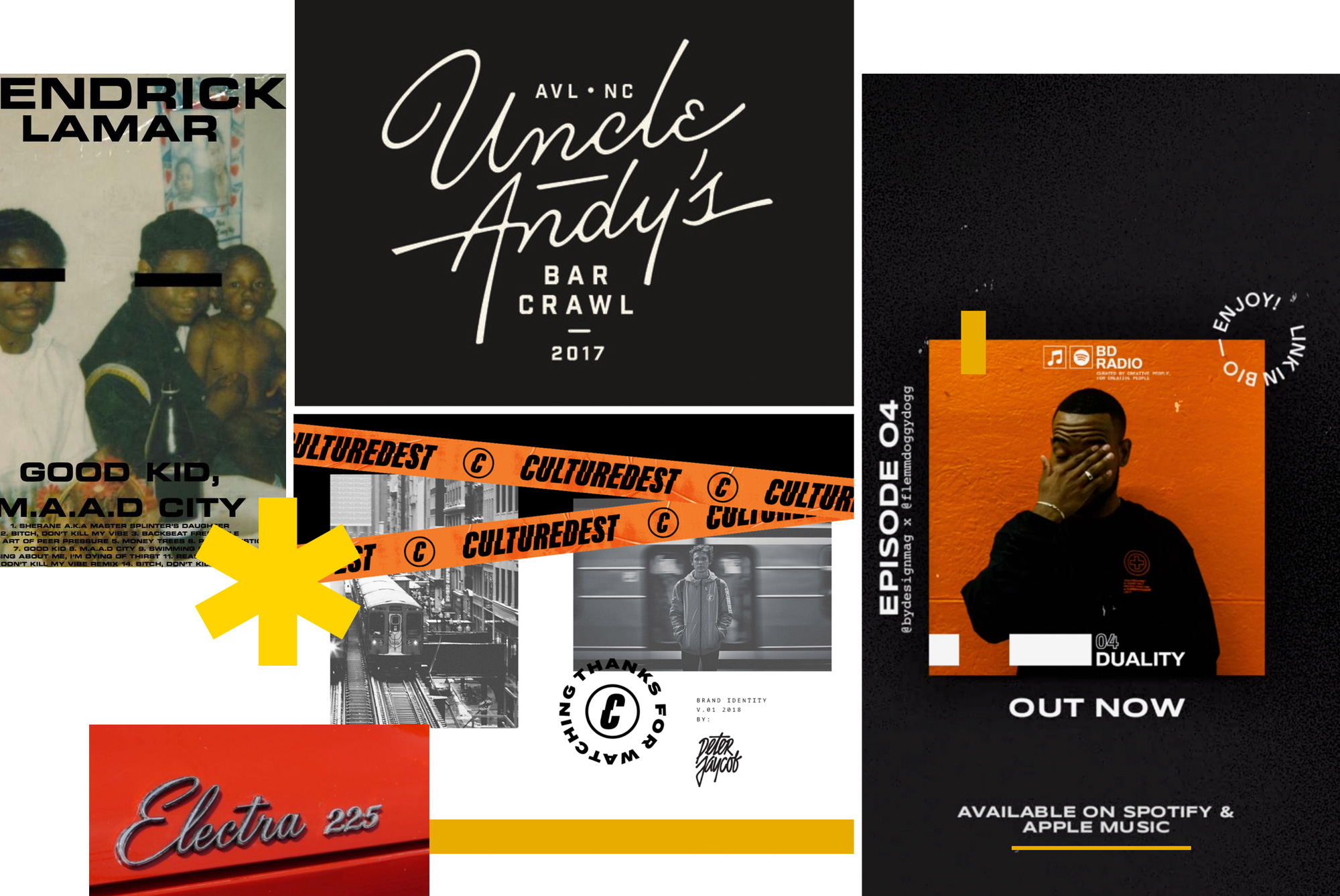
Deuce and a Quarter Moodboard
Image sourced from Pinterest. All images for inspiration and reference purposes only.
BLACK
#000000
ORANGE
#EE6323
GOLD
#EDBC0E
BONE
#F3F2EE
COLOR PALETTE
The color palette is based on the energy we wanted to bring to the brand. We wanted the visual identity to feel bold and not afraid of what it stands for—unapologetic—while at the same time, appealing inviting and welcoming. So we used two warm colors as the primary accent colors (orange and yellow) to achieve that goal. These colors give off positive energy while representing joy, liveliness, comfort and optimism and paired with black and white, it gives us a high contrast that contributes to the boldness of the brand.

LOGOS & SYMBOLS
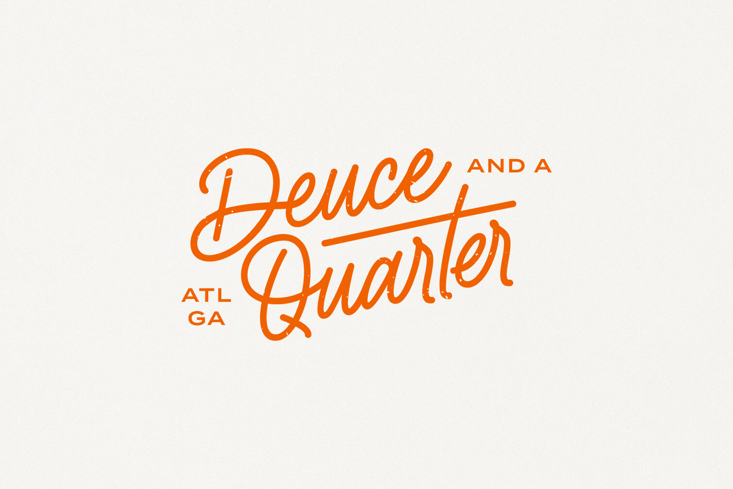
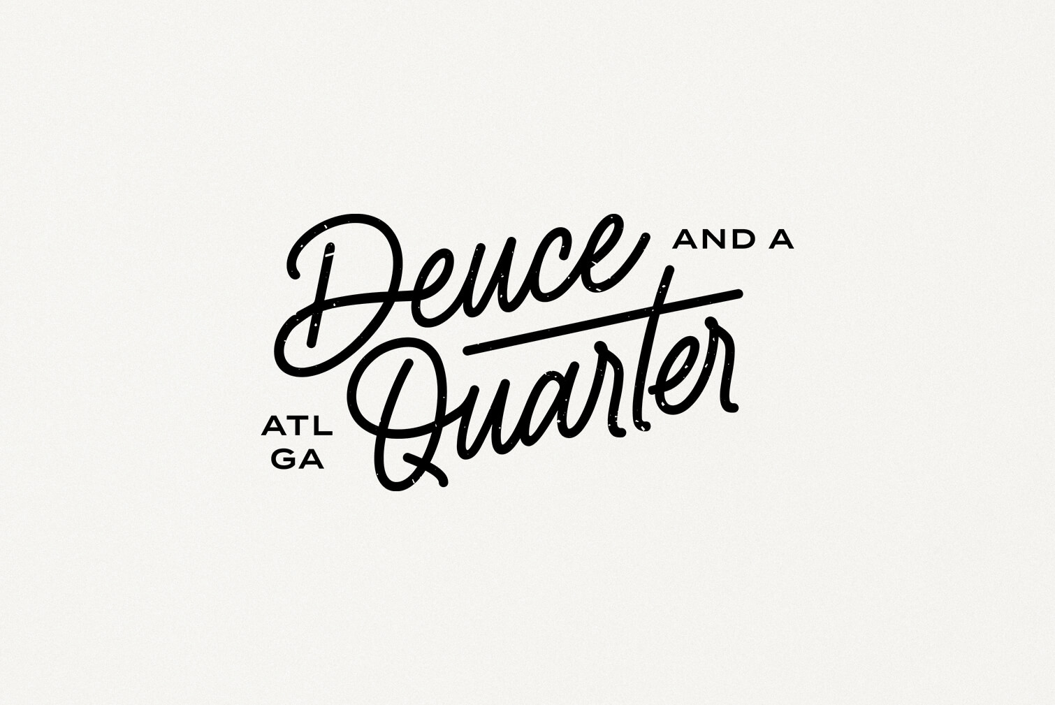
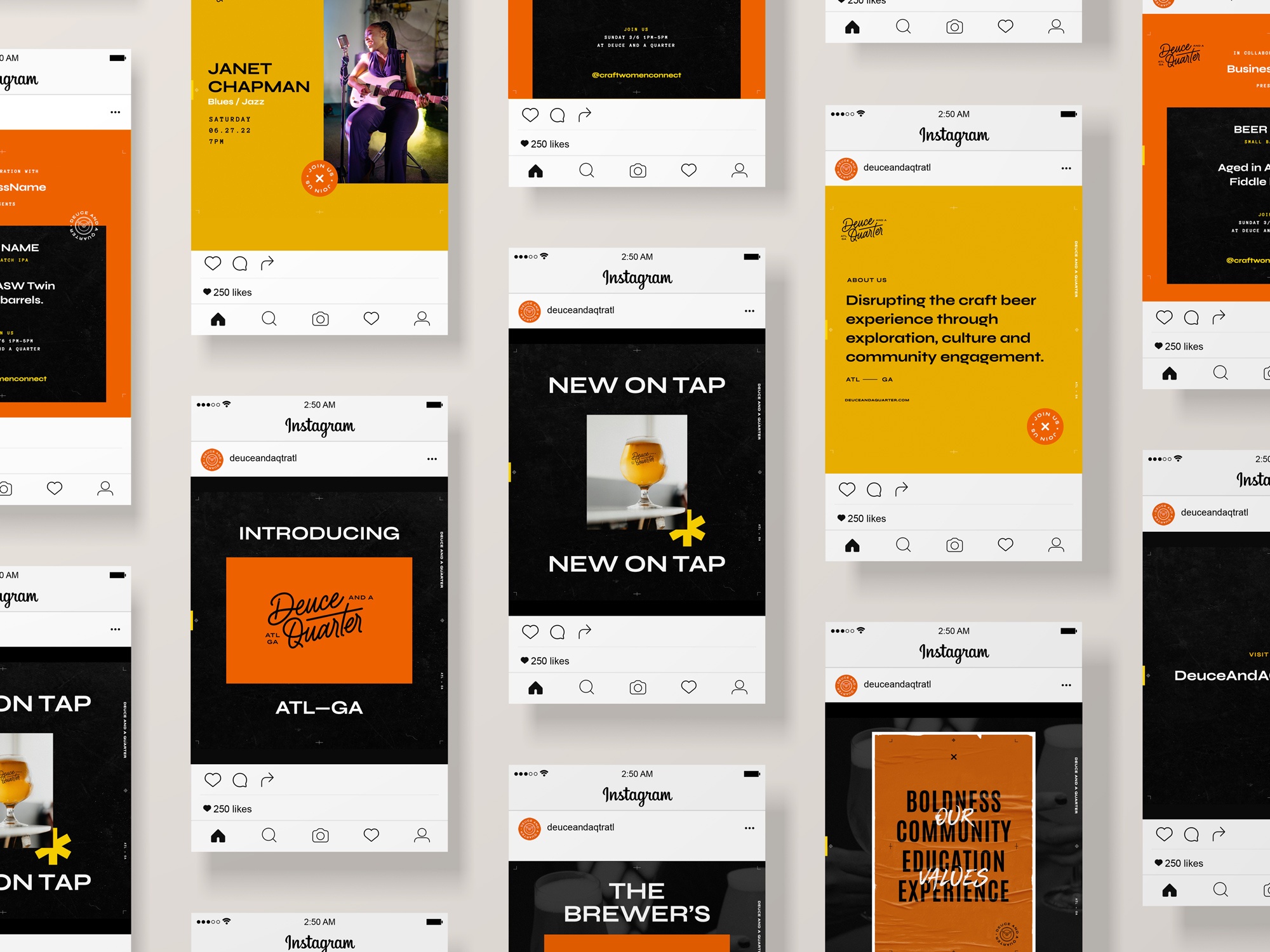
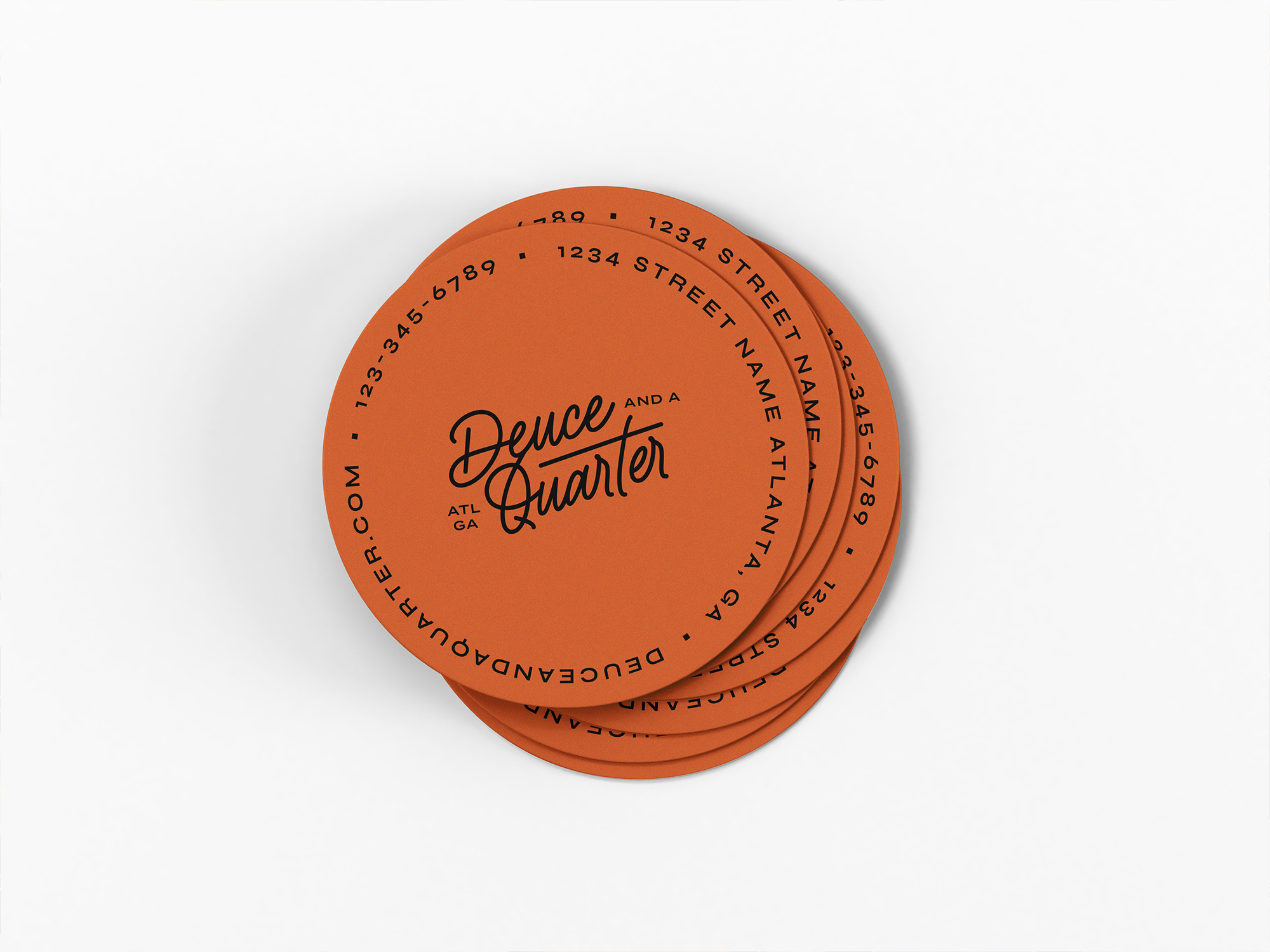
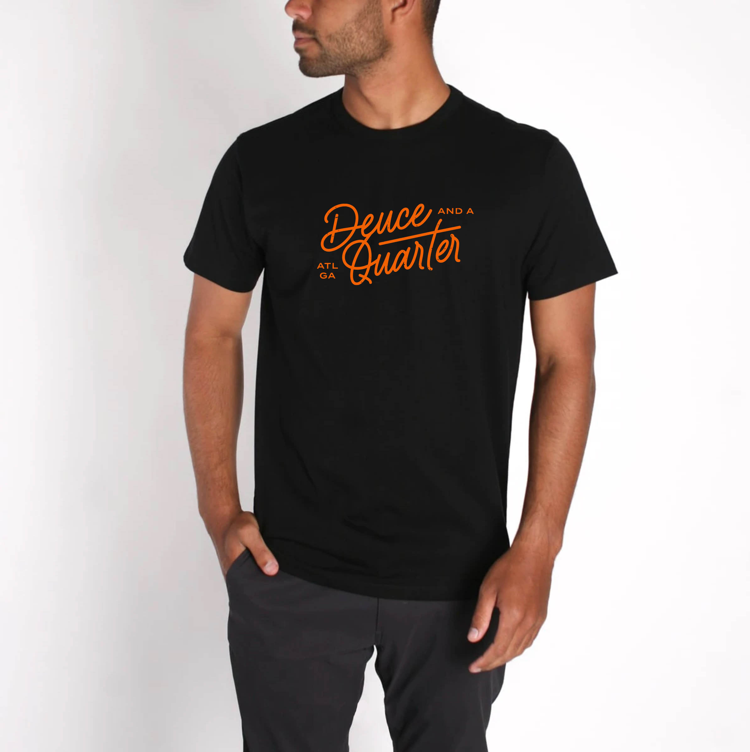
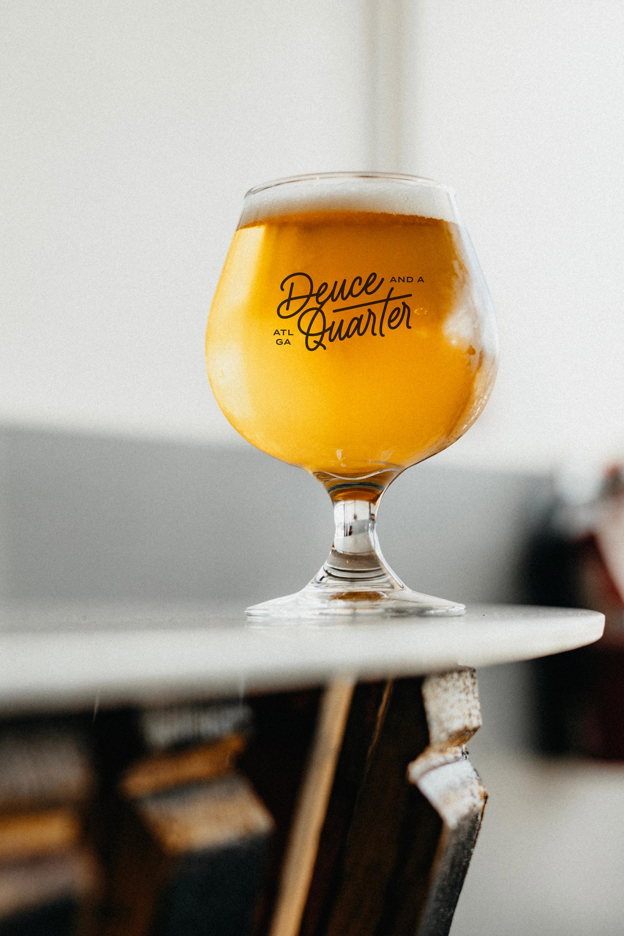
Inspired by retro car embles, we mixed a script with a modern sans-serif font and brought the classic, typically recognizable steering wheel of the deuce and a quarter into the symbol. Not an obvious detail but one that brought a smile to Darren's face and a hint that honors his grandfather.


“
”
20
22
CLIENT TESTIMONIAL
Darren Armstrong /
Deuce and a Quarter
Donaji helped me create a focus. Everything kept coming back to the mission: branding, color, image, smallest details. She kept getting me back to my "why". I really value that. She also challenged me, she asked the right questions—questions I didn't ask myself.
ATL
GA
Her acuity to detail—being able to translate the purpose and meaning to the visuals. The way in which we told the story—it's all tied together and connected the way that it should be. The launch was really great, got a lot of positive feedback.
I'm most proud of the intentionality behind, really being clear with the message. And in that clarity people are like "you're really passionate about that!". Donaji helping me contextualize that, you can't put a price on that.
Ready to transform YOUR business?
Get in Touch
Get in Touch
Get in Touch
Get in Touch
Get in Touch
Branding for established women of color entrepreneurs and BIPOC-led organizations wanting to unapologetically stand out and clearly amplify their message.
Branding for established women of color entrepreneurs and BIPOC-led organizations wanting to unapologetically stand out and clearly amplify their message.
Branding for established women of color entrepreneurs and BIPOC-led organizations wanting to unapologetically stand out and clearly amplify their message.
Branding for established women of color entrepreneurs and BIPOC-led organizations wanting to unapologetically stand out and clearly amplify their message.
©Donaji Mejia 2024 | Privacy Policy | Terms
©Donaji Mejia 2023 | Privacy Policy | Terms
©Donaji Mejia 2023 | Privacy Policy | Terms

EST 2016 - CA
EST 2016 - CA
EST 2016 - CA

