ABOUT—
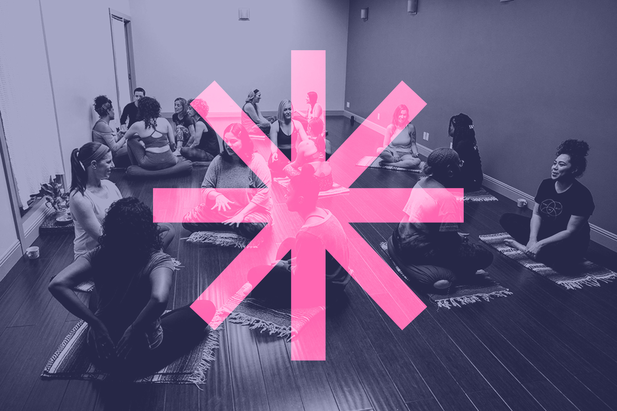
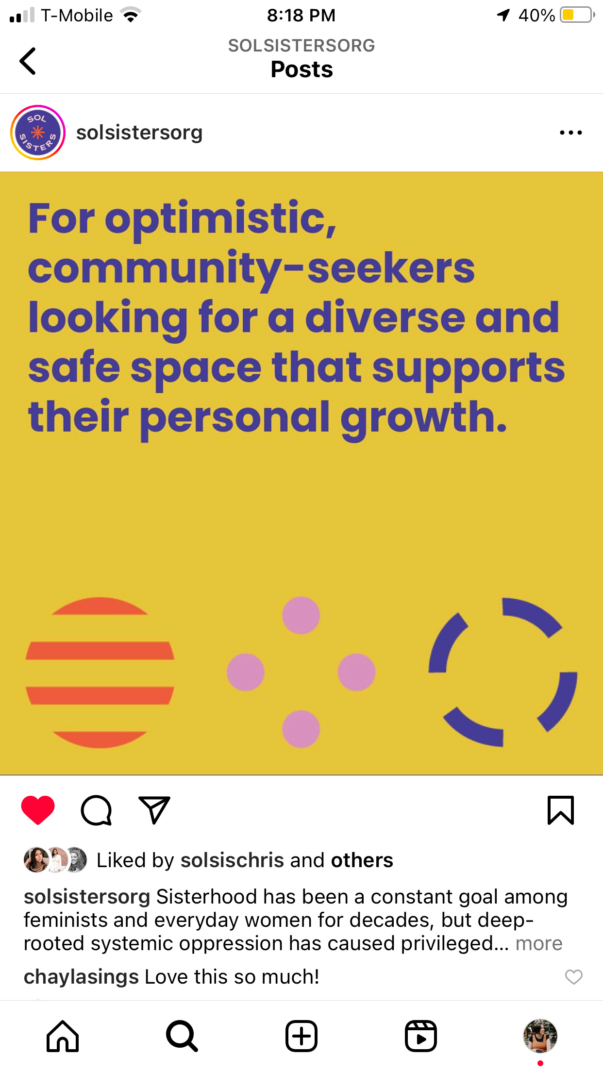
Sol Sisters is an Oakland-based, nonprofit organization for optimistic, community-seekers looking for a diverse and safe space that supports their personal growth.
Sol Sisters is an Oakland-based, nonprofit organization for optimistic, community-seekers looking for a diverse and safe space that supports their personal growth.
Sol Sisters is an Oakland-based, nonprofit organization for optimistic, community-seekers looking for a diverse and safe space that supports their personal growth.
Sol Sisters is an Oakland-based, nonprofit organization for optimistic, community-seekers looking for a diverse and safe space that supports their personal growth.
Sol Sisters is an Oakland-based, nonprofit organization for optimistic, community-seekers looking for a diverse and safe space that supports their personal growth.
2022
///
Brand Strategy
Visual Identity
Website Design
CLIENT'S CHALLENGE—
CLIENT'S CHALLENGE—
CLIENT'S CHALLENGE—
The main challenge that Sol Sisters was experiencing was finding clarity as to how to communicate to the world what the organization does. They were going through a transition phase and needed to really focus Sol Sister's mission, positioning, services and overall branding branding in order to launch and introduce their refined vision and mission to their community.
THE GOALS—
01.
Clarity and redefine who Sol Sisters is as an organization and clearly communicate it to their community.
02.
Define services and updated programming for Sol Sisters 2.0 and prepare for re-launch in 2022.
03.
Create a clear brand identity that supports who they are and elevates the organization so it feels more professional.
—
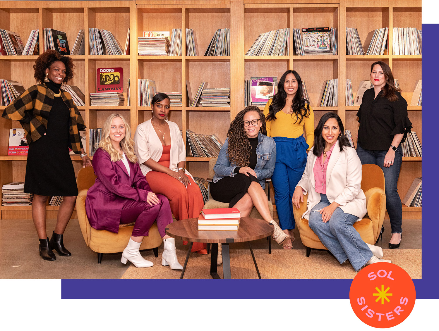
Sol Sisters empowers women through inclusive experiences and a community of sisterhood.
Sol Sisters empowers women through inclusive experiences and a community of sisterhood.
Sol Sisters empowers women through inclusive experiences and a community of sisterhood.
THE STRATEGY—
As part of the process, their mission, vision, values, services, and programming were clarified. With their new approach in mind, the goal was to clearly communicate to their community Sol Sisters' new vision and relaunch with full alignment and cohesion both internally and externally.
One thing that Geordee and I understood was there are a lot of transformational coaches out there, so it was key for Geordee to know her ultimate vision as a solid foundation for her ‘WHY’. It is this ‘WHY’ that will set Geordee apart from her competitors in her space.
The other goal was to focus was to bring energy and life to the brand, reflective of Sol Sister's community and services. It also needed to appeal to their target audience in order to increase their community membership, event attendances, donations, partnerships, and social media engagements.
One thing that Geordee and I understood was there are a lot of transformational coaches out there, so it was key for Geordee to know her ultimate vision as a solid foundation for her ‘WHY’. It is this ‘WHY’ that will set Geordee apart from her competitors in her space.
With that in mind, we focused on creating a brand that feels energetic, bold, friendly, inclusive, and hopeful. The brand now represents everyone they serve, clearly communicates who they are and what they offer, and has a fun and inviting presence that captivates their target audience.
One thing that Geordee and I understood was there are a lot of transformational coaches out there, so it was key for Geordee to know her ultimate vision as a solid foundation for her ‘WHY’. It is this ‘WHY’ that will set Geordee apart from her competitors in her space.
KEYWORDS—
Supportive / Hopeful / Confident / Inviting / Inclusive / Bold / Feminine / Fun / Casual
Supportive / Hopeful / Confident / Inviting / Inclusive / Bold / Feminine / Fun / Casual
THE IDEAL CUSTOMER—
The optimistic community-seeker.
BRAND GOAL—
To make women of all backgrounds like they belong by making them feel seen, safe, and celebrated.
The Rebrand
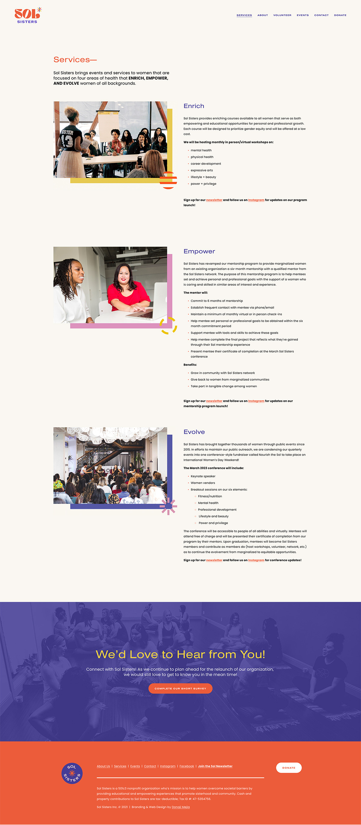
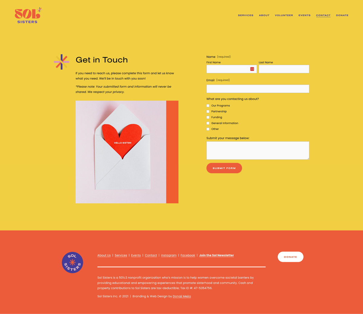
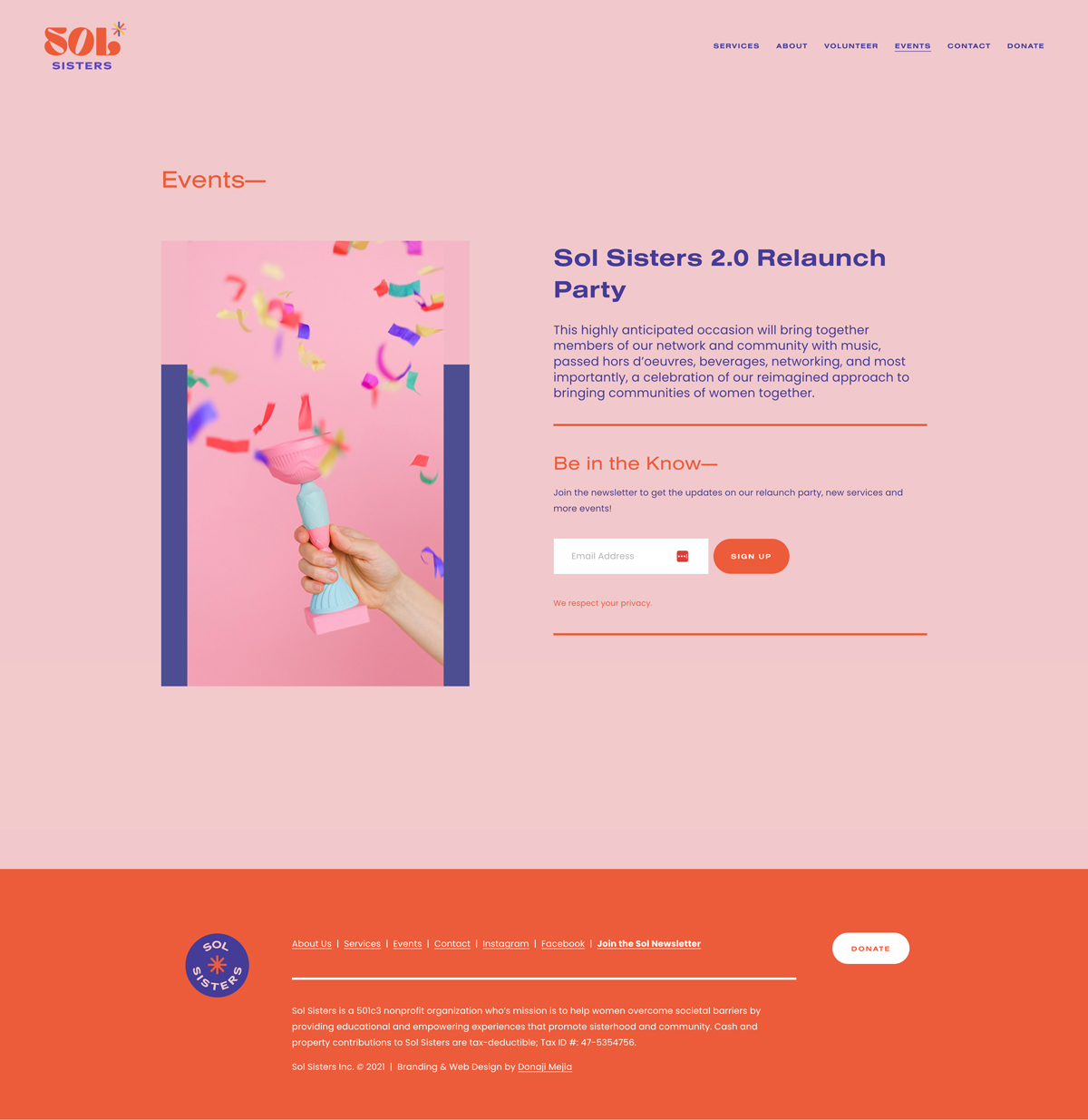
Use the black bar to view the before and after of their home page.


RED
#FF4E28
RED
#FF4E28
PURPLE
#47399C
YELLOW
#EDC300
PINK
#E78BBF
COLOR PALETTE
The color palette is based on 4 colors that represent the brand's focus areas (mental health, physical health, expressive arts, and professional development) and bring warmth to the brand colors with feminine and fun aesthetic.
PRIMARY LOGO
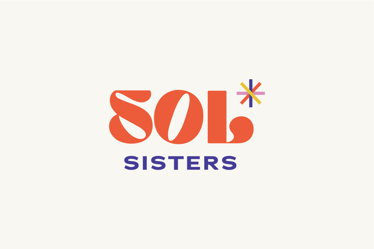
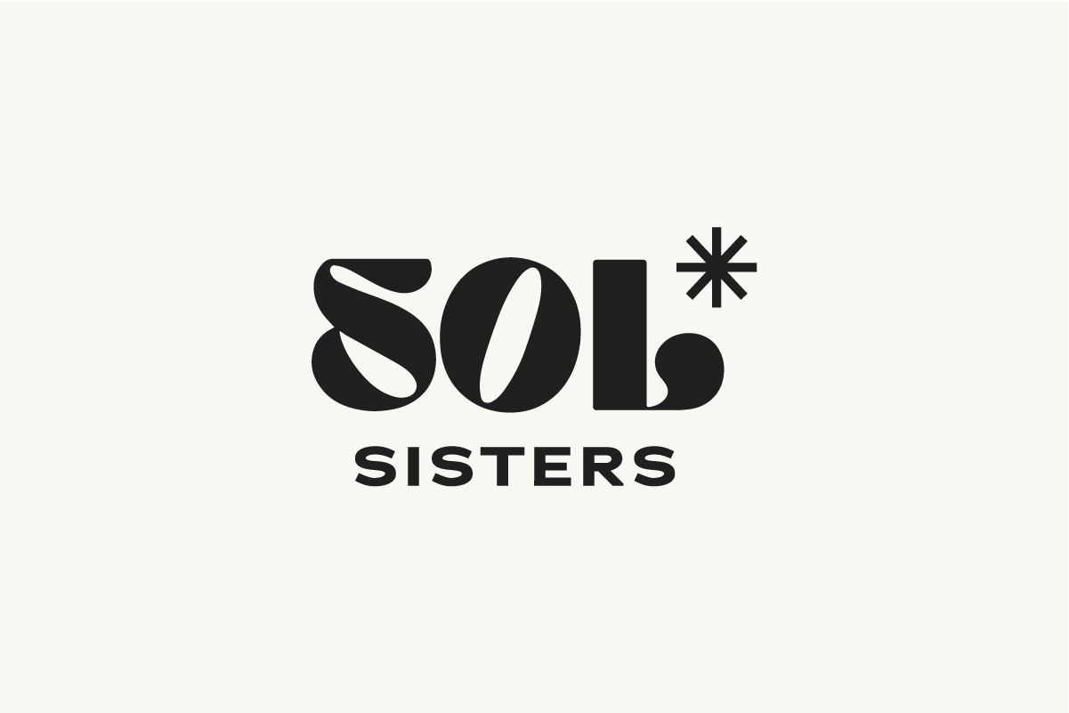
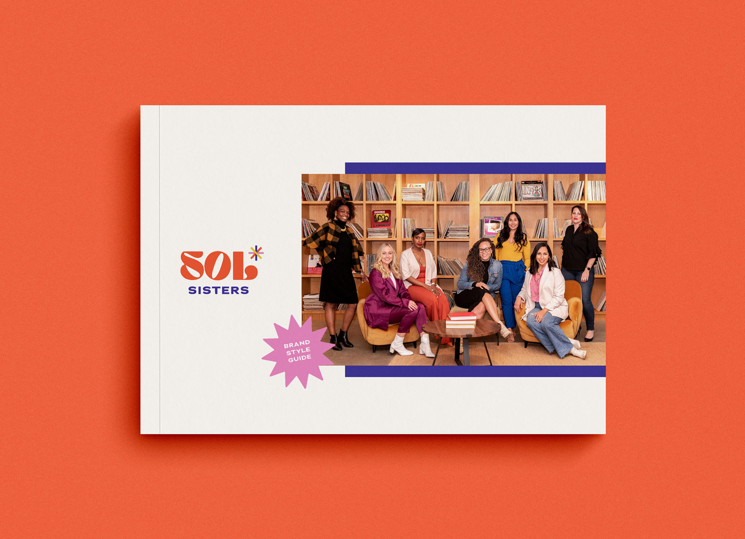
The primary logo is set in a chunky font for the "Sol" part, meaning "sun" in Spanish. The bottom we kept in a simple sans-serif for the word "sisters". The approach was to make it modern, bold, fun, playful, yet slightly feminine.
The simplified starburst represents a few things such as the sun (sol), community, radiance, and inclusivity. The primary version is set in the brand colors to represent diversity the organization brings in terms of areas of focus and the women they serve.

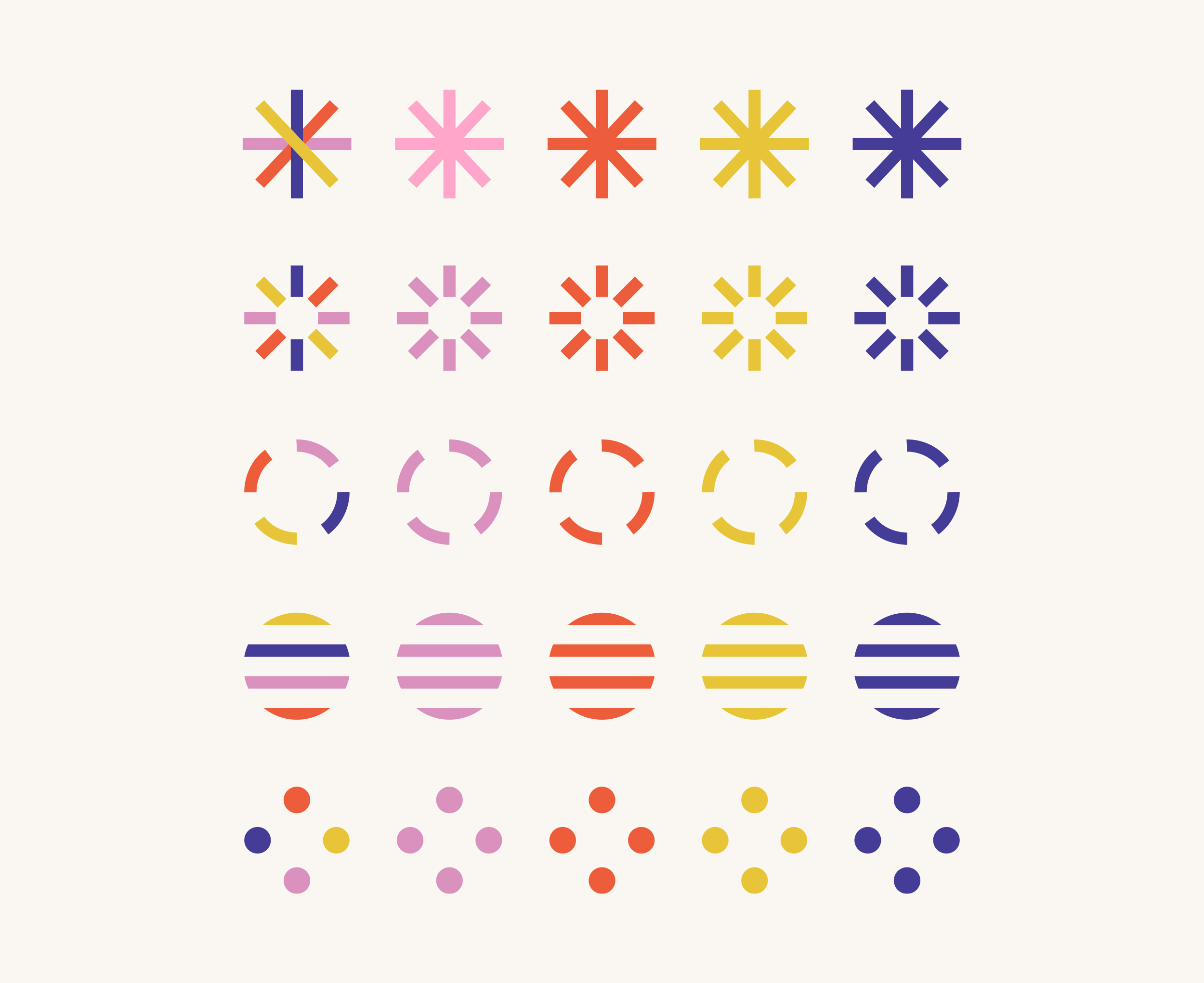
SECONDARY LOGOS (ABOVE) AND ICONS (BELOW)
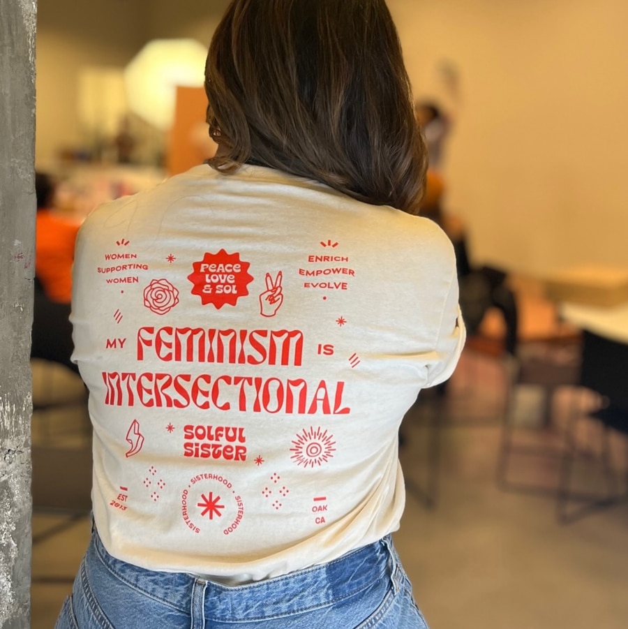
We created a secondary logo that looks like a stamp so they can create stickers for merch or gifts that can be part of their events. For their visual language, we built a small library of icons to use as graphic elements that also are used to communicate categories in their services/programing. Overall, the visual identity is a dynamic on that be used in all of their touch points and grow as they continue to do so.


“
”
20
22
CLIENT TESTIMONIAL
Christine Coleman / Sol Sisters
We wanted to step up in our community presence and for people taking our non-profit in a more desired way—in a way that would entice peple to join our network. The impact is that now we can then work more efficiently. The brand now is an anchor in all we do, so the impact is substantial.
OAK
CA
Ready to transform YOUR business?
Get in Touch
Get in Touch
Get in Touch
Get in Touch
Get in Touch
Branding for established women of color entrepreneurs and BIPOC-led organizations wanting to unapologetically stand out and clearly amplify their message.
Branding for established women of color entrepreneurs and BIPOC-led organizations wanting to unapologetically stand out and clearly amplify their message.
Branding for established women of color entrepreneurs and BIPOC-led organizations wanting to unapologetically stand out and clearly amplify their message.
Branding for established women of color entrepreneurs and BIPOC-led organizations wanting to unapologetically stand out and clearly amplify their message.
©Donaji Mejia 2024 | Privacy Policy | Terms
©Donaji Mejia 2023 | Privacy Policy | Terms
©Donaji Mejia 2023 | Privacy Policy | Terms

EST 2016 - CA
EST 2016 - CA
EST 2016 - CA

